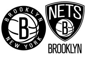
 To go along with their new arena and new city, the former New Jersey Nets have gotten a new logo. Long gone are the blue and red designs and vintage black and white is back in. The black and white and a tribute to the old subway signage systems. “The Brooklyn Nets logos are another step we’ve made to usher the organization into a new era,” Jay-Z said in a statement. “The boldness of the designs demonstrate the confidence we have in our new direction. Along with our move to Brooklyn and a state-of-the-art arena, the new colors and logos are examples of our commitment to update and refine all aspects of the team.” This is all great for the Nets and their organization, however, none of this is going to make them a better team. Isn’t competing and winning the whole point of a sports team? What is changing the venue going to when your superstar point guard, Dereon Williams, probably won’t even play as a Brooklyn Net there. Will they compete any time in the future? Definitely not. The East is way too stacked with talent and all this glitz and glamour is just a mirage because they are lacking talent. Maybe they should put all this energy into trying to retain Williams who is the one who will bring them to a championship.





Saved as a favorite, I like your web site!